monolexic timeline
for anyone who has stumbled upon this site’s discourse on fonts and readability, this page attempts to graphically summarize the evolution of these monolexic fonts.
See also quasimono for the quasi-proportional variants.
monospaced atkinson hyperlegible
this whole journey began with the discovery of the Atkinson Hyperlegible Font developed by the Braille Institute. After settling on it as my ereader font of choice for its superior readability attributes, i then began the search for a monospaced version of this font.
Finding none, i customized the Iosevka font i used for programming to create this facsimile..
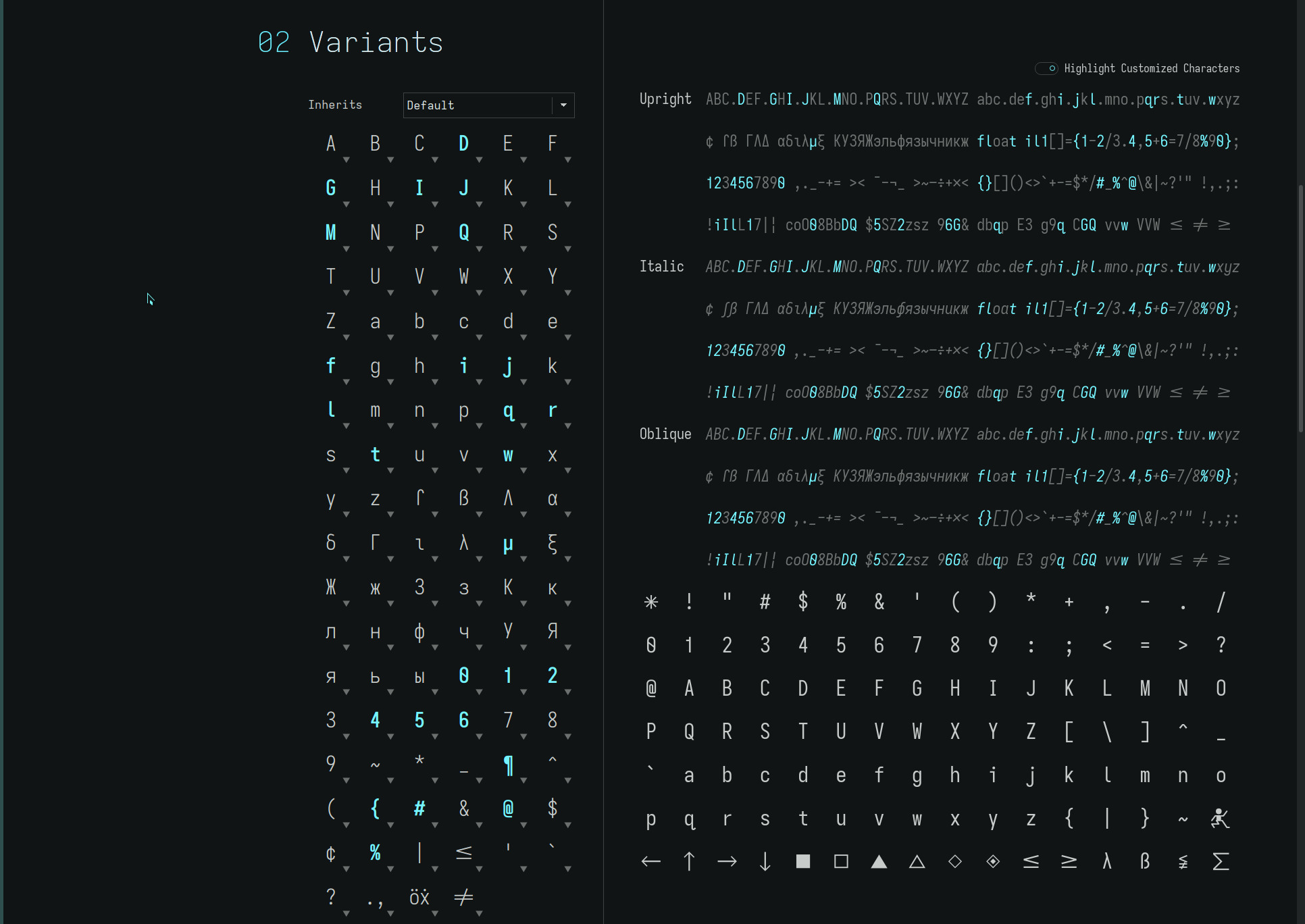
While the original intent was purely to create a better source code font, this font eventually found its place on my ereader. And, much to my surprise, displaced the original Atkinson Hyperlegible Font which inspired it as my favourite font to read with—which, i surmise, was due to the uniform visual cadence of its monospaced cell width.
Kerning facilitates beautifully tight character spacing, maximizing line word density. However, this also places an additional onus on the visual cortex and language facilities to uncompress this information—insignificant as it may seem—which may explain why monospaced fonts appear to be easier to read in general*.
*Data is very sparse regarding the readability of monospaced versus proportional fonts. In the end, one can only determine one’s personal predilection which will also be heavily influenced by one’s aesthetic. The uniform air around individual letters, though, does appear to benefit dyslexia.
dyslexia
as a result of ereader usage, further investigation into font legibility—and the inherent compromise a fix cell width imposes on a character set—led to an exploration of dyslexia and readability..
..namely, the issue of dyslexic mirroring and/or rotating glyph shapes. The OpenDyslexic font addresses this by weighting (thickening) the base of its glyphs to “anchor” the letters horizontally—and for some dyslexics, this may be the optimal solution (albeit, the font loses the clean geometric glyph shapes we are accustomed to).
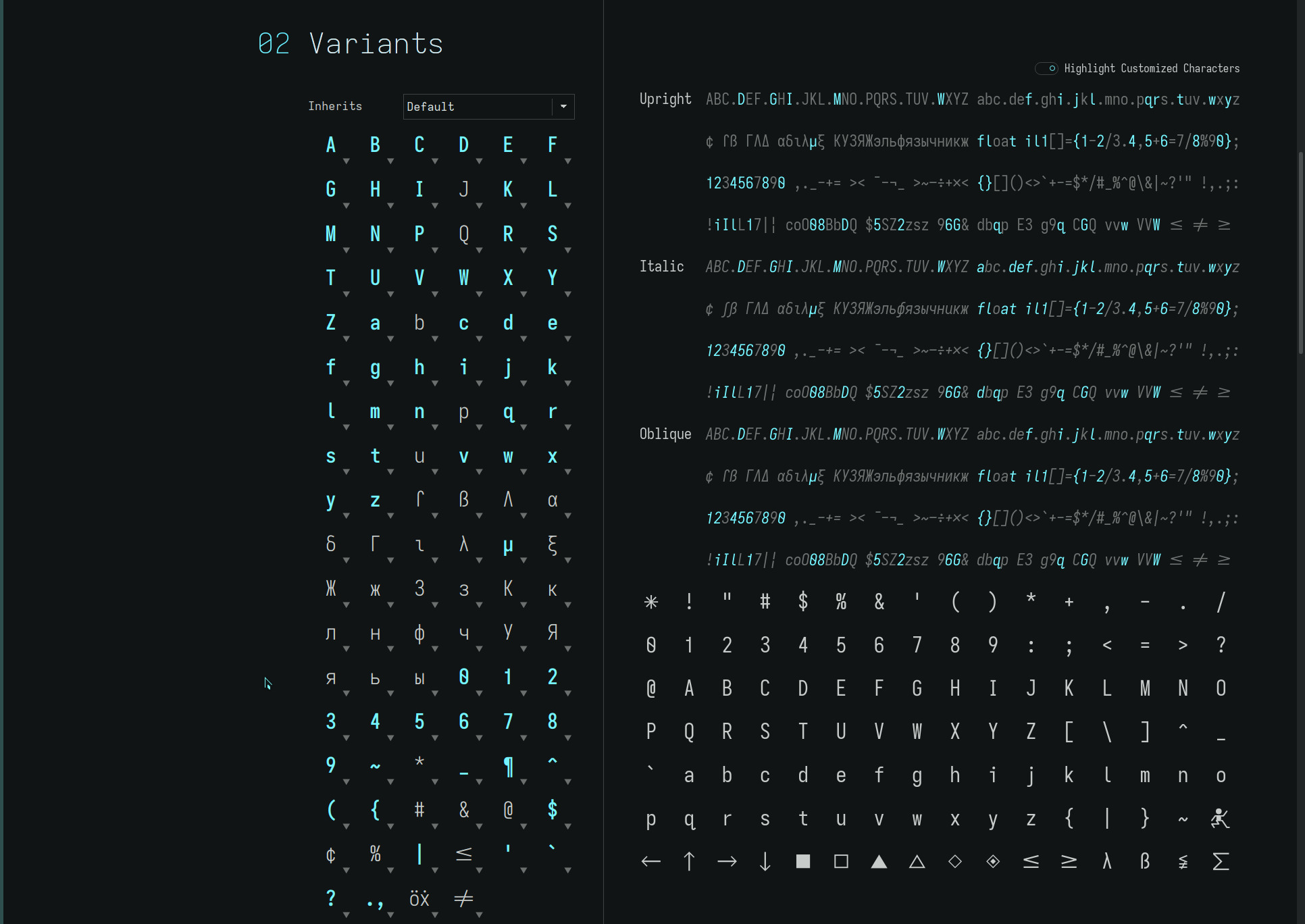
For the Monolexic fonts described on this site, a less radical but more aesthetic approach (IMO) is taken by eliminating the mirrored glyph shapes used in almost all typefaces for the lower case b d p q and n u glyphs.
The Atkinson Hyperlegible Font already has a unique hook-tailed lower case q, so taking this into account (along with a few more “open” glyph choices) the base Hyperlegible glyph set becomes..
..and the unique (and more open) glyph shape substitutions..
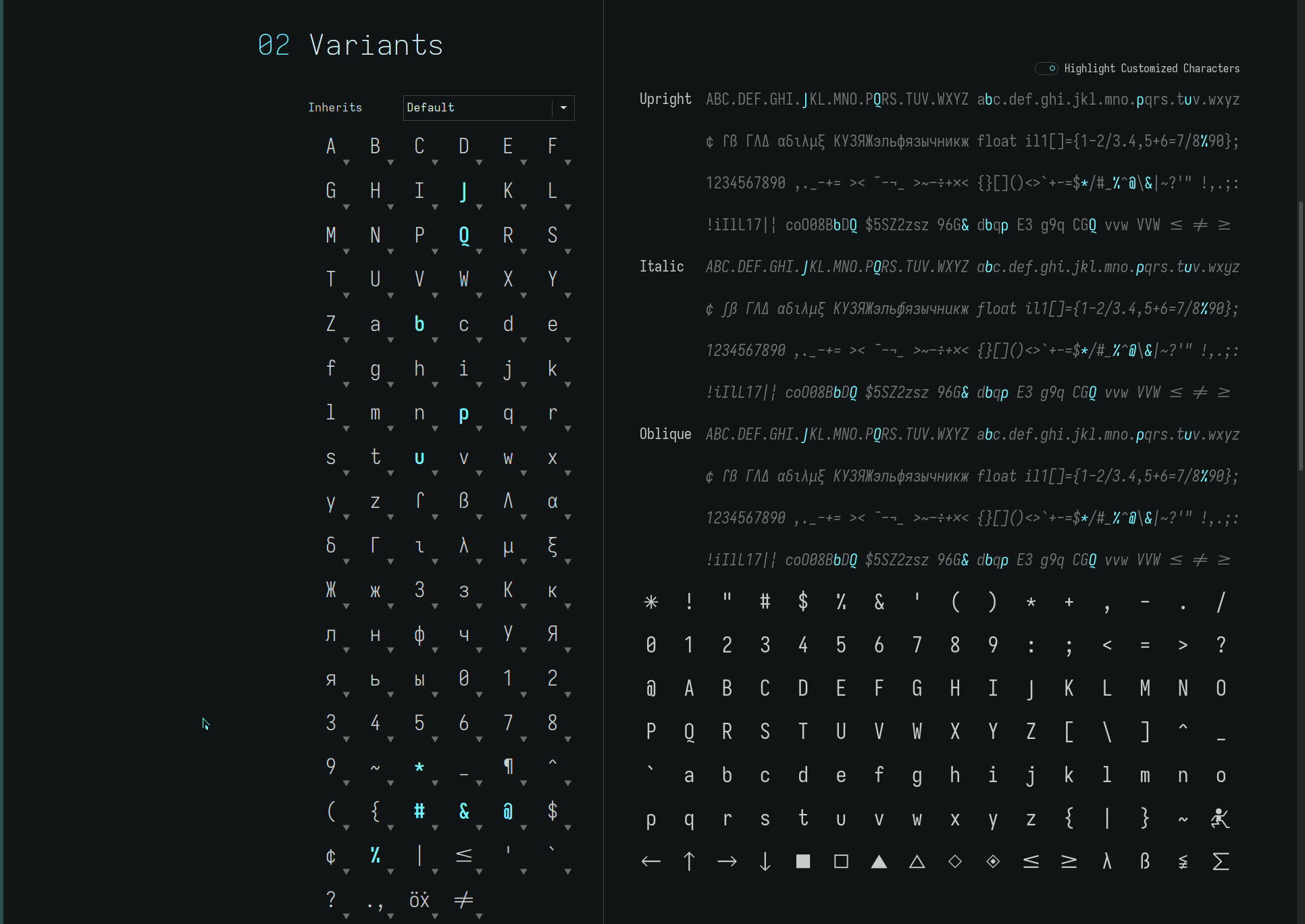
These two glyph sets together form the Monolexic font set—with its unique 2x cell width word spacing to further improve dyslexic readability—which became my default ereader font for several months.
grotesk glyphs
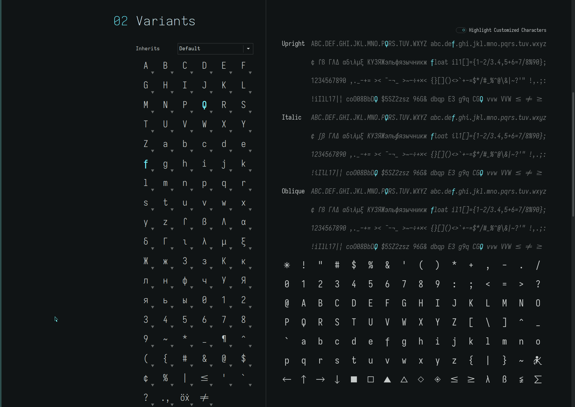
adding the descending lower case f to Monolexic creates the Unolexic font set, reminiscent of Univers Grotesk. Adding the vertical-crossing capital Q (and alternate word spacings) create the grotesk variants for a maximum legibility typeface..
elementary glyphs
adding the single-storey lower case a to Monolexic creates the Geolexic font set, reminiscent of our elementary school alphabet. Adding the straight (angled) capital Q and open capital B P and R (and alternate word spacings) create the elementary variants for a distinctly more open typeface..
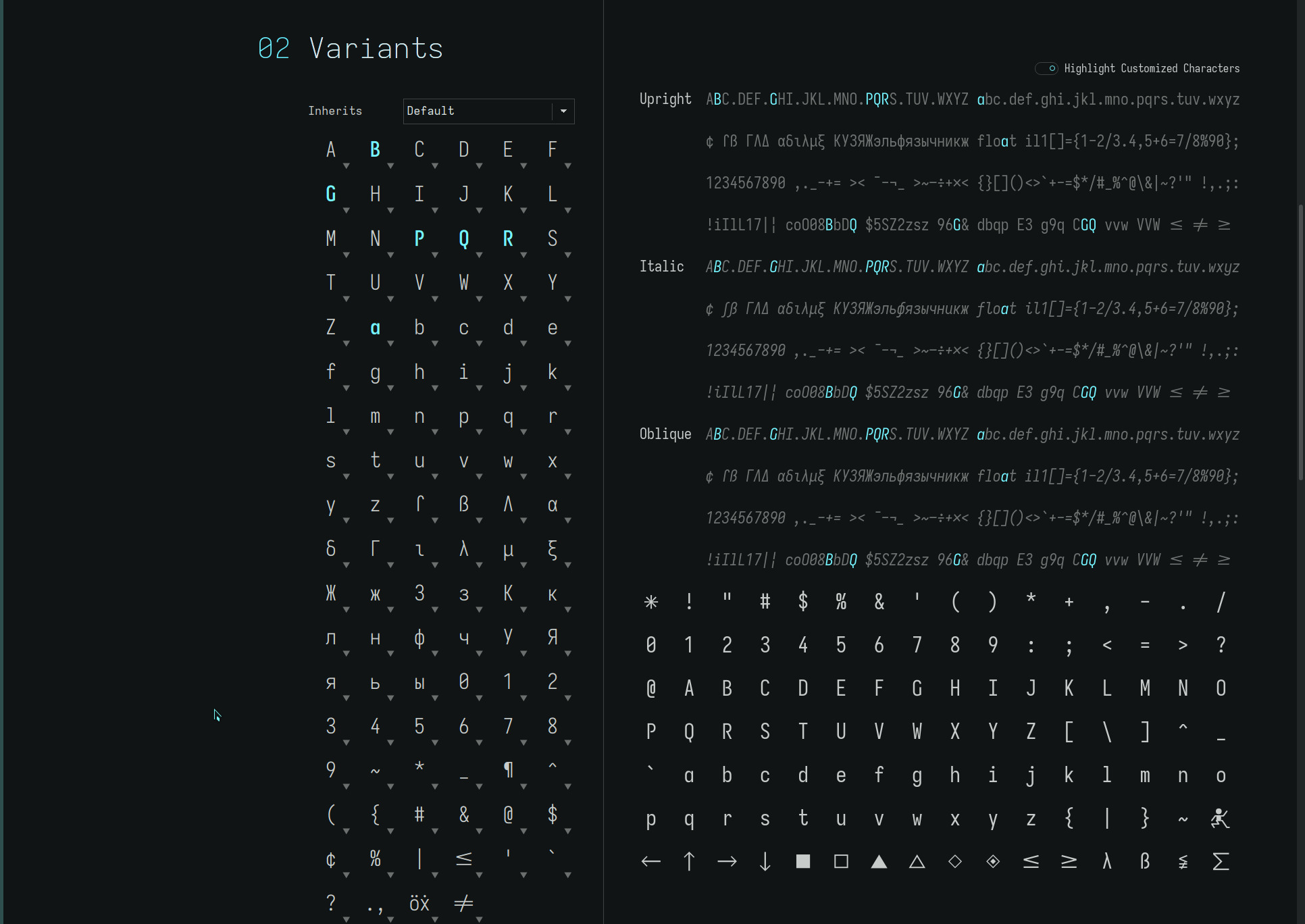
fonts
a variety of font sets with capital Q G and open glyphs, and alternate word spacings are available in the repos. Specific permutations may created from source. As always, YMMV.
The font files may be found here.